The Problem
While The Ordinary greatly appeals to regular people because of the attractive price point and quality of product, my research has shown that people can lose interest with the description of the science within their products, mainly the jargon filled blocks of text on their product pages.
The Solution
Improve the experience of the website by increasing education of everyday users of The Ordinary’s skincare products.
My Role
Timeframe
Programs Used
UX Research & UI Design
8 weeks
Miro, Figma, Dovetail, Google Meet
The Ordinary is a skincare brand known for it’s high quality product, clear and minimal brand identity, and a price point which can appeal to skincare users of all pay grades.
Despite this, the information on the Ordinary’s website product pages detailing the technology used in the products was losing users with its poor visual hierarchy, and jargon filled paragraphs.
I saw this problem and potential space to reformat theses sections, making for a more educational experience for users of all levels of skin care knowledge.
Why do this?
What is it?
When is it used?
Who is it for?
As part of my research process, I spoke with a designer at Deciem, The Ordinary’s parent company who told me the user base was broad as they believed rightly that, “skin care was for everyone”.
Users interested in skincare try multiple different brands, and can have a rotating routine of products which varies for each user.
Users from my research said they mostly get products from department stores, or multi-branded online retailers ie. beautybay.com or sephora.com.
A user could come to the ordinary’s website while researching the brand themselves, and wish to learn about the brand and the products in more detail.
This redesign helps these users get an even more detailed understanding of the Ordinary’s products and ethos to help educate users on what they are using.
The redesign consists of a reformatting of sections of The Ordinary’s product pages, namely the Technology and Directions sections, removing the jargon filled paragraphs with more easily digestible graphs, and pop out definition bubbles for words of ingredients allowing for education into the ingredients within.
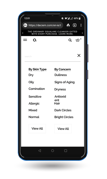
The was also a proposed implementation of a skin type filter to the search as it was a standard expected by multiple users from the usability tests.
Project Summary
The Ordinary was not a company I was previously aware of, however I was quick to discover that many people I knew used their products daily due to the their simple packaging, high quality product and reasonable price point.
In my research, which you’ll see below, the company seemed to lose engagement when users got to the technology and directions area of their products pages.
In doing this project, I hope to reformat and make these sections clearer, and more educational while strengthening the brand by further democratising the science in their skincare products
Project Overview
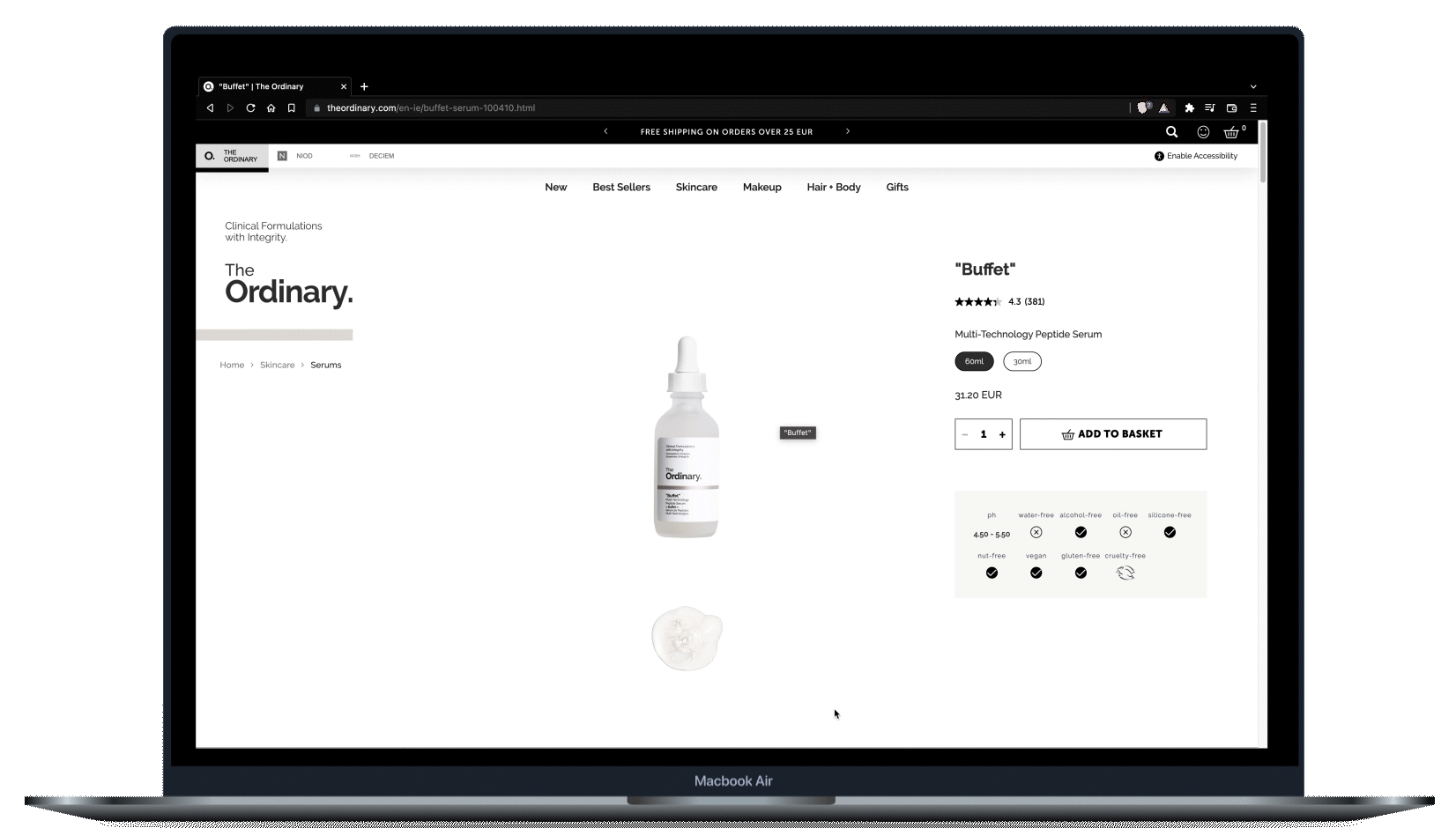
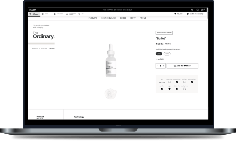
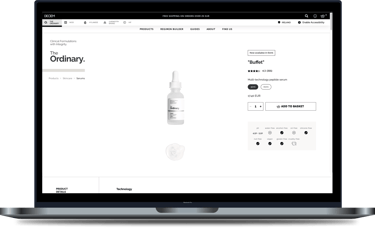
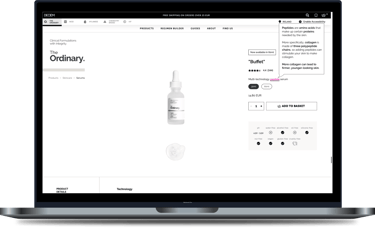
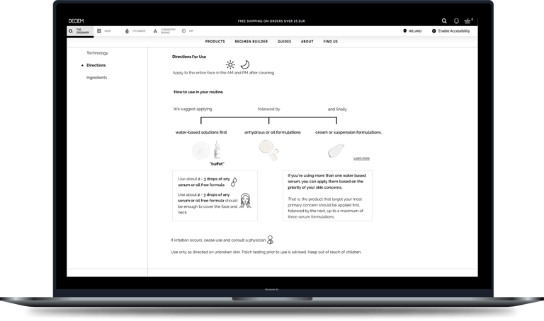
Product page for "buffet" prior to redesign
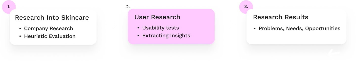
Company Research
I got in contact with a UX designer at the parent company of The Ordinary, Deciem.
No Target Demographic
I enquired about the demographic of The Ordinary, and was told they didn’t have a target demographic as the philosophy is; “that skincare is for everyone and it works across every demographic.”
Science First!
The company promotes a “science first approach to skincare”, making sure the science is respected and known among their users.
Heuristic Evaluation
I undertook a heuristic evaluation of the site to initially spot some of the issues myself.
Pros
Cons
There is an aesthetic consistency with obvious CTA’s, simple colour palette, and use of simple icons.
The interface is relatively easy to understand.
There is a lot of jargon in the Technology and Directions section.
The directions area is underwhelming.
There is poor hierarchy with minimal headings, sub-headings.
There was also no warning for users when products that don’t mix well are placed in the shopping cart, Eg, Retinol and Lactic Acid.
This could be fixed with a warning in the checkout and some attached information, allowing for further education of users.
User Research - Usability Testing
With the usability testing, I wanted to validate...
If people understand the current information on the product pages.
How do people choose skincare products for themselves.
Main Patterns Observed From Testing
Problems
Needs
Opportunities
The heavy use of jargon in the product descriptions.
The lack of warnings for ingredients that don’t mix together.
To feel confident about their purchases.
Use the correct skincare products for their skin type’s needs.
Provide an educational experience for users.
Give users all the necessary information about any areas problems might arise (ie. some ingredients not working together.
Usability Test Insights
Furthering education is appealing -


The use of technical terms can deters some users -
Searching by skin type was of interest -

The willingness users had to want to learn about the products and their ingredients was most intriguing.
This interest could absolutely be capitalised on, further educating users on the technologies and ingredients used
"I want someone to tell me like what squalene cleanse does. what a caffeine solution does, all of this type of thing, right?"
In skincare, there is no shortage of it's own complexities in the make-up of each ingredient and product.
This is why careful democratising is important, if you're trying to appeal to ordinary people
"Remembering you've got it at this affordable price. These people who are at this budget, aren't going to know what this is supposed to mean. Yes. It's all fancy and medical, but I don't know what it is"
Many users interviewed highlighted the needs of their own skin type. In searching for skincare products, people inform purchasing decisions on what they know their needs are.
"Their packaging doesn't really tell you much either about what skin types it would be good for."
Secondary Hypothesis
There was a secondary hypothesis emerged that some users favoured searching for products based on their own skin type.
This was not something that was on the site at present so, I began to plan to add this filter to the search and see if it would add to the experience.
Solutions!
The solution it revealed itself to be...
Breaking down the technical terms with simple descriptions.
Reformat the description section also to make it clearer and more engaging.
For the skin type hypothesis, I would be adding the filter to the search feature.

Drawing up the User Flows with Margarita from Cyber Patio.
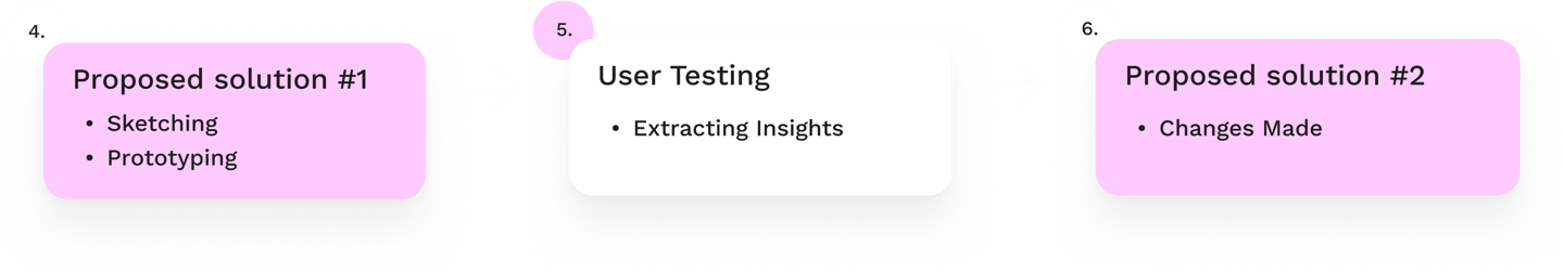
Proposed Solution!
The below "after" screens are the final iterations which were informed by insights from later user testing.
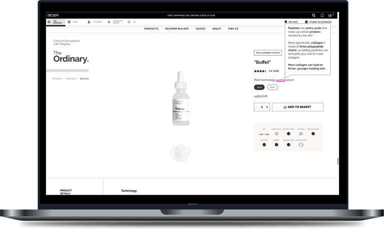
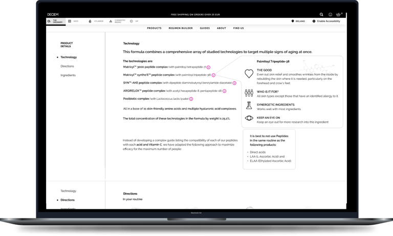
1. The top of the product page having a pop-out definition bubble for certain words.
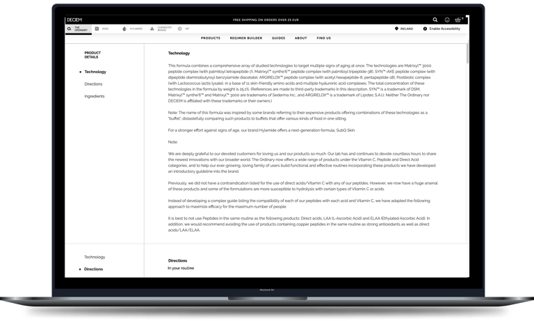
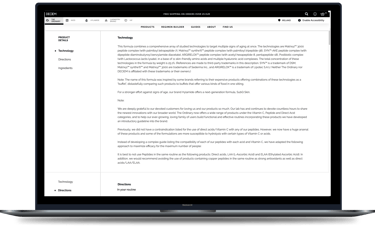
Before
After
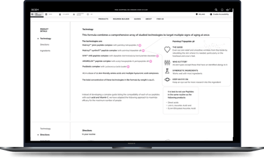
Reformatted Technology section + Definition Bubbles
Before
After
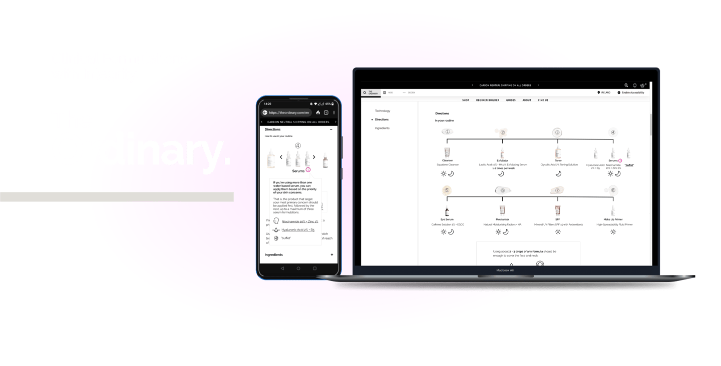
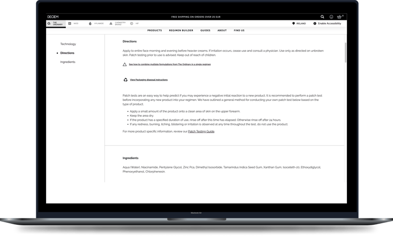
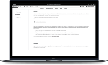
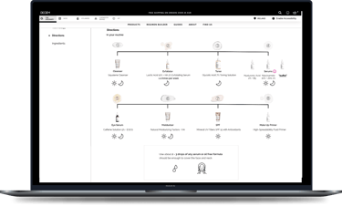
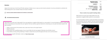
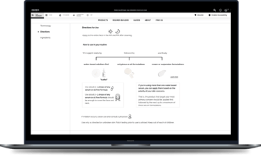
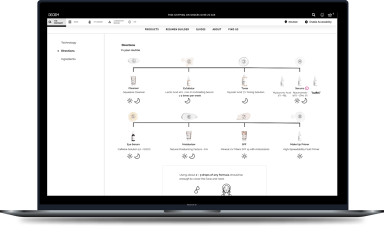
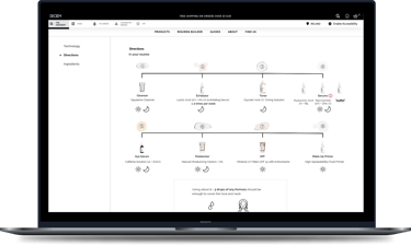
Reformatted Directions section with shiny new graphic.
3. A new filter placed at the search window for skin type and concern.
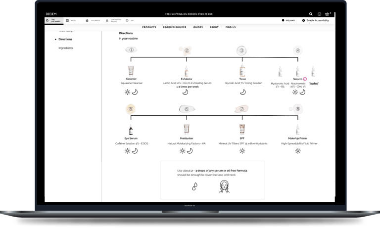
2. A reformatting of the technology and directions sections adding hierarchy, definitions and overall clearer visual representation.
I took this chance to use the mobile version of the site to have another interface to design
Before
After


Other Features Redesigned
1. A warning in the checkout and an information page for instances of items that don't mix being purchased together.
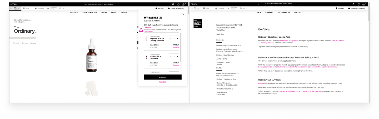

A warning in the checkout for instances of two conflicting items being purchased together.
A corresponding page detailing what does conflict and why they should be not be used in the same regimen.
2. Moving the patch testing from the product page to the confirmation email
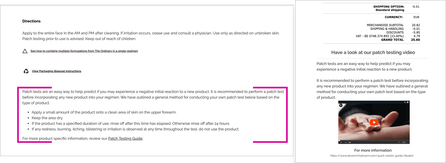
Moving the patch testing warning to the confirmation email with a video along with the warning. Outlining the steps one should take to patch test the product.
User Testing
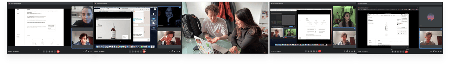
In making the changes to the page, it was time to test my design.
The testers were varying from people I knew with skincare knowledge, and also found on skincare subreddits.
Testing Insights
#1
#2
#3
There was some subtle changes between the initial prototype I made and the final version.
The directions section had the biggest change based of the patterns which emerged.
This was the first iteration prior to testing.
The updated version as suggested by testers.
Things I would improve about my testing skills...
I will admit that my testing skills were not the sharpest as I was guilty of some leading approaches to getting testers to do things with the prototype.
There were instances were I told people to “check out the information icon” for the definitions of the technology terms, rather than see if they noticed them at all and whether or not they were a noticeable size.
Rather than saying to someone, “search for buffet”, I should have said, “find buffet”, allowing the tester to find it more freely.
Finally, I was guilty of not making the prototype extensive enough, so this lead to asking people, “would they use the skin type filter here?” when it came up rather than asking them to search for a product for their skin type and seeing if they use the filter.
Nevertheless this round of testing was much more of a learning experience for me knowing approaches to not take, it’s all part of my own growth as an interviewer / tester.
Conclusion
It was a lot of fun to do a redesign on a topic which I knew little about.
The process of this redesign taught me that an eye for design is not only to be used for a project from scratch but also to improve an existing product.
With this project, it was great to not have to reinvent the wheel or redesign the entire site, rather make smaller adjustments, that enhance the overall experience of a site helping to convert browsing users to purchasing users.