

Project Brief
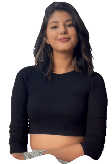
This is a project I did with fellow designer, Dhari Sachdev.
Dhari wanted to do a branding project for a personalised chocolate builder much like builders she saw for skin and haircare projects.
For myself, this project was more focused on UI design and working on my animations, with a minimal approach to UX research.




Dhari Sachdev
Nollaig Brennan
Branding
Illustration
UI
Motion Design
Our Roles
Hypothetical Scenario
While this project was made for fun, I wanted to shed some light on where a project like this could exist in a real world scenario.
Why do this?
What is it?
When is it used?
Who is it for?
The company implementing a feature such as this could be looking to enhance their branding.
In doing so could set them apart from competitors and increase user engagement as well as data capture.
Such a feature is aimed at users of confectionary brands who when browsing an online store wish to buy a particular item that was not available to them.
It would also be for users who treat someone in their life to a personalised bar of chocolate, giving them exactly their favourite flavour
This type of product would be used at a variety of scenarios, such as when users are online shopping for treats, looking for a gift for an occasion.
Much like the personalised hair and skin care builders, when users are researching new products, finding the website of the brand.
This personalised chocolate builder is a feature for a brands website, or could be expanded upon and made into an app.
Users are given a series of questions, with engaging copy, UI and motion design. Answering each question leads them towards creating their own bar of chocolate.
The Prototype
Have a play around with the prototype, and if you’re interested in seeing the process of how we put it together, keep scrolling!
The Process!
Here’s how we got to our lovely chocolate builder starting with....
Benchmarking!
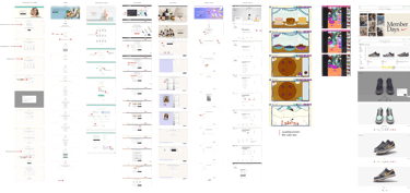
We first did some benchmarking of the examples Dhari had in mind and a few others I knew of.

Lo - Fidelity Wireframes

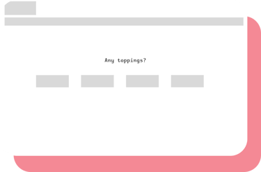
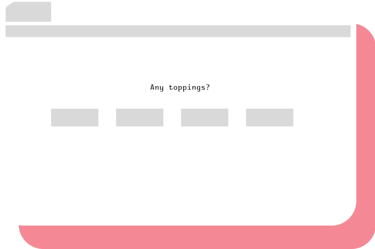
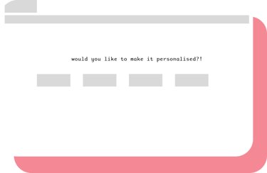

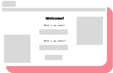

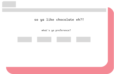

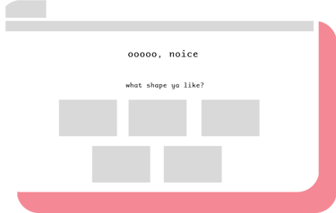

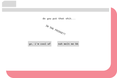


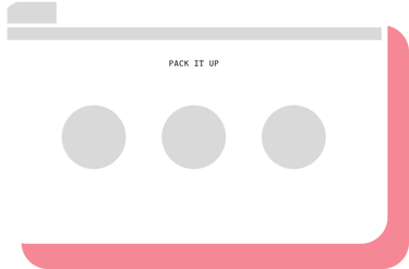
We started with figuring out structure and initial typography
Hi - Fidelity Wireframes
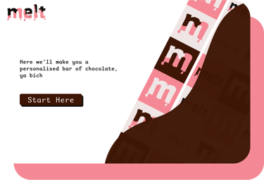


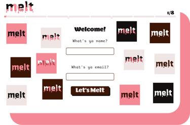
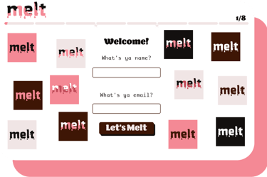
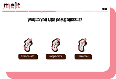
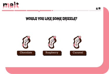
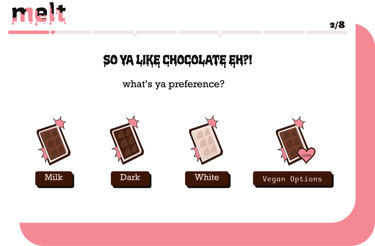
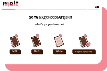

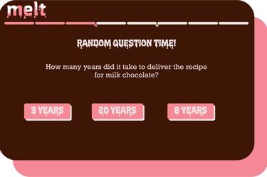
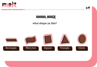

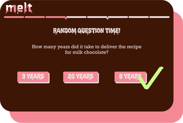

I added the UI along with Dhari’s initial illustrations and branding
Dhari's touch!


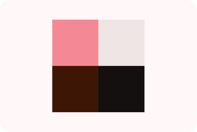
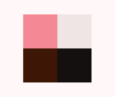
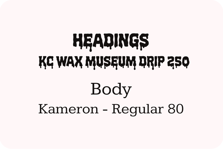
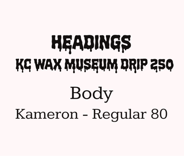
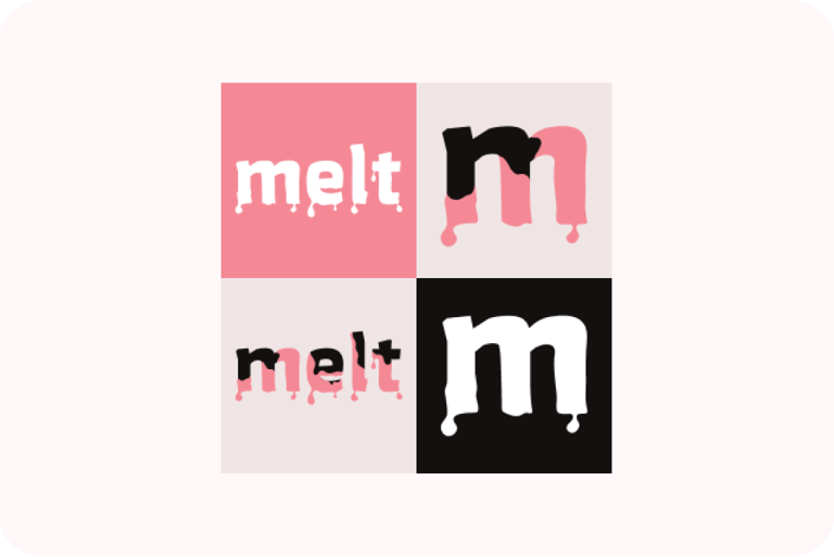
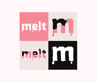
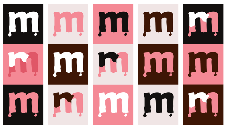
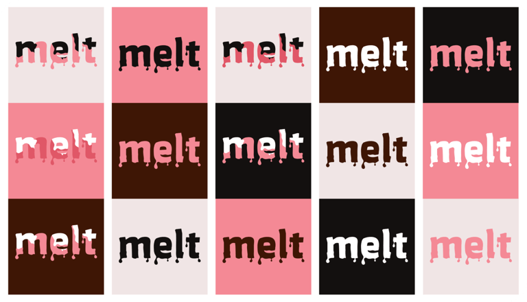
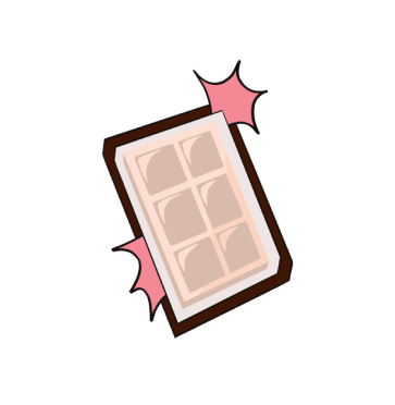
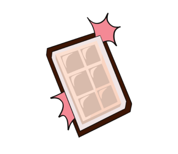
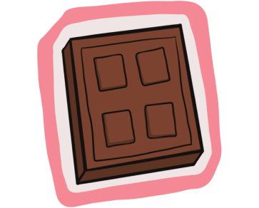
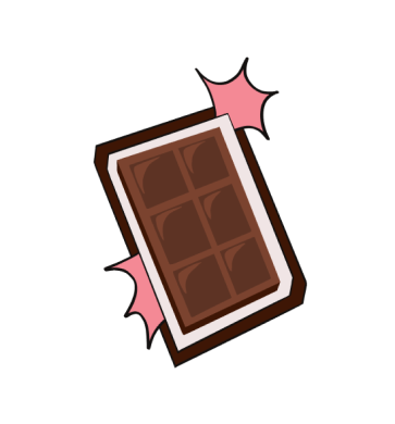
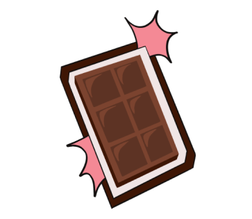
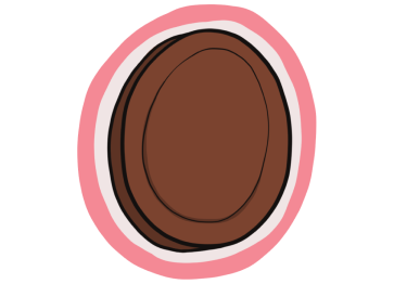
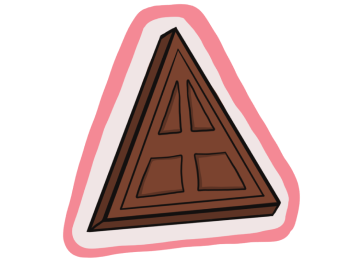
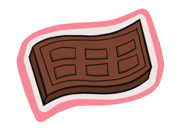
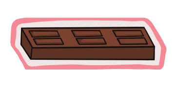
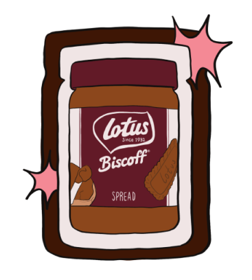
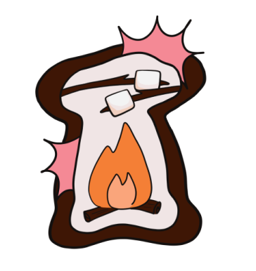
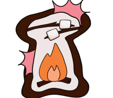
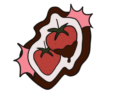
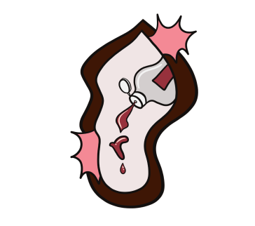
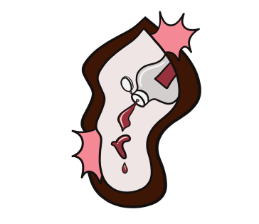
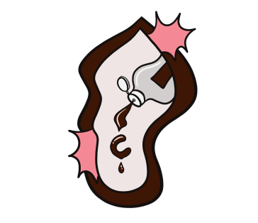
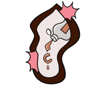
Here's the branding and illustrations added by Dhari to give the project some personality. Once these were finalised we were good to go with our prototype

Dhari's Branding
Colours
Typography
Logo



Dhari's Illustrations







Conclusions
While this project was mostly for fun, and for refining our skills, we learned a lot from doing it.
For myself, it was an great opportunity to try new things with my UI animations, and to continue to improve learning how to make experiences flow with tasteful, and on brand animations


See ya in the next one!


