draftwerk
Combining the logistics of online artistic collaboration
My Role
Timeline
Tools Used
UX Research & UI Design
11 weeks
Miro, Dovetail, Figma, Google Surveys & Meet
PROJECT OVERVIEW
Why do this?
What is it?
When is it used?
Who is it for?
draftwerk was conceived based off my own observations of the online collaboration process of which I am a power user, as a musician and video maker.
The need to simplify the cumbersome process of collaborating online was something that interested me, as I knew it would other creative collaborators.
Users for this digital product range from all kinds of creative people who take part in collaborative projects online. From musicians, to video makers, to podcasters.
The simple UI design has potential to appeal to various types of users, outside the initial user base which I conducted the research on.
They could use draftwerk for a variety of projects that could expand the user base, but the initial target users were creatives in the digital arts.
The online collaborative process varies from each user, though a service like draftwerk would be used at all stages from the inception of the project, and can be used to store and track iterations of projects right though to completion.
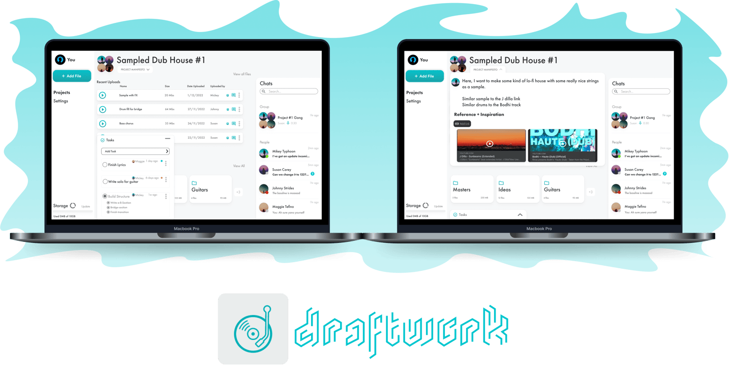
draftwerk is a desktop app that allows users to consolidate the organisation of their online artistic collaborations such as file transferring, messaging capabilities and project management.
Defining The Challenge
This was my first project I did with Cyber Patio.
As an artist myself, I've noticed a problem which occurs during online collaboration.
The process I know all too well has its drawbacks. Getting files, updates and messages to collaborators and keeping on top of projects is a headache.
Most, even well organised, artistic collaborations are messy...
Let’s get everyone on the same page
RESEARCH
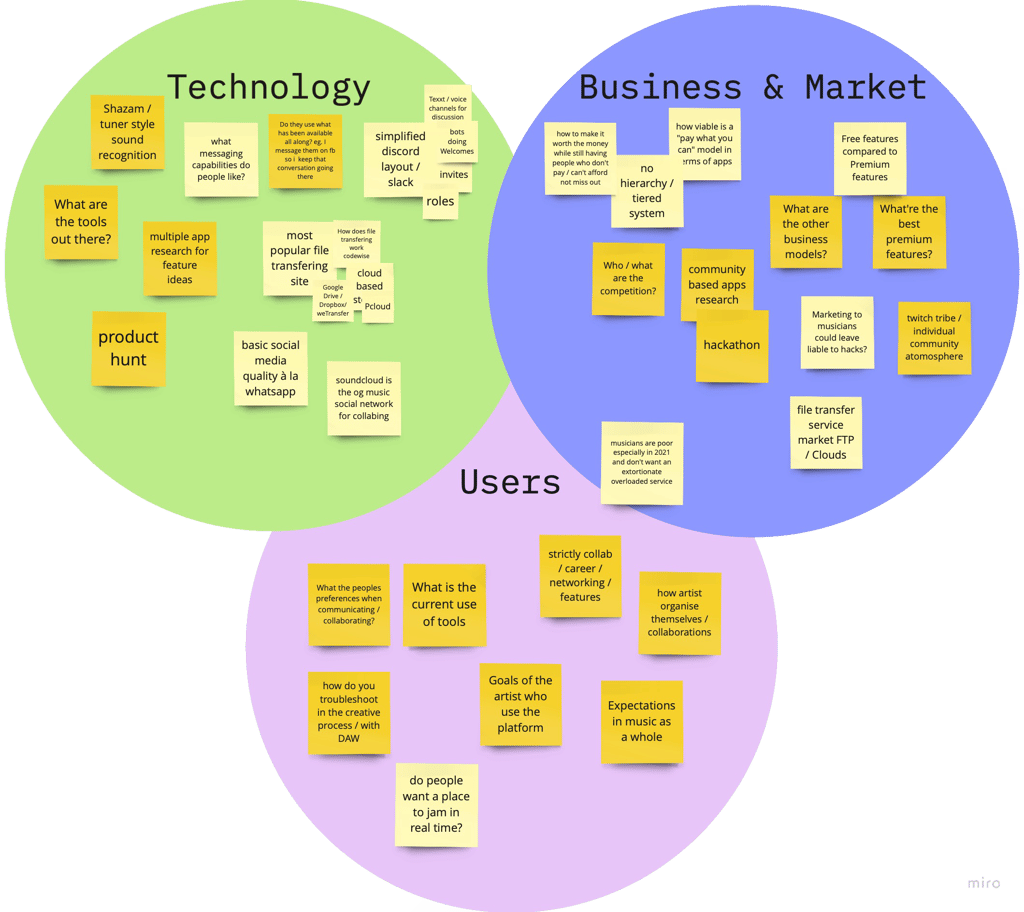
Research Questions
My questions to research. Made in Miro.
In needing to gather research for the project, I knew only so much about the habits of artists online.
I needed to understand, out of all of the methods I knew peopled had for transferring files, was there a unified reason people picked their preferred one?
I also needed to see if there was a correlation between the features of various messaging services and their appeal to artists.
Initial Hypothesis
Due to the laborious, uninspiring nature of artistic project management;
Artists would benefit from online collaboration / communication services being consolidated.
Research Goals


Find out habits of online artistic collaboration
What, if any is the most popular messaging service and file transferring service amongst creatives?
What are artists needs when communicating, transferring files and collaborating online?


Trends!!
TheRiseOfTheIndie
Genre-Less Music & Playlists
Visual / Printed Albums
Lo Fi & Chill Music
Live Streaming Concerts
Men I Trust
Odd Future
Beyonce - Black is King 2020 / Lemonade 2016
Frank Ocean’s Magazine. “Boys Don’t Cry”
"The Lo-Fi Girl" from Chilled Cow
Chill Hop Music


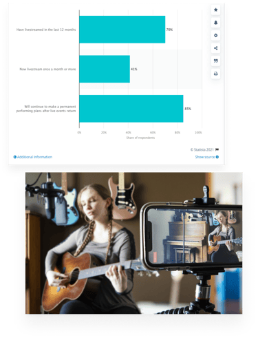
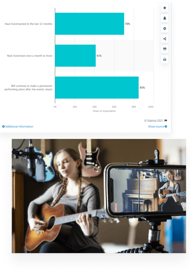
Before I set out to accomplish these goals, I thought I’d have a look at some...
I also had a look at the competition after that to see how close some are to the idea I had in mind.


Competitors Research
Now that I had an idea of the market and the competitors,It was time to have a look at some...
USER RESEARCH!!
1 Survey,
20 participants,
14 questions
1 In Person Interview
4 Remote Interviews


Survey & Interview Insights
48%
say online communication can be done better
79%
of groups send ideas online
used a mixture of file transferring services
46%
55%
are part of a group
"Remembering the different tools to send files to different collaborators can be an issue"
Our survey says...
Adobe Audition is the most popular DAW
Premiere Pro is the most popular video editor
Google Drive is the most popular file transferring service
3 Insights from the 5 users interviewed...


#1 - Genuine Connection
All of the artists stress the importance of having a common goal with your collaborator and building chemistry together to fulfil the goal that is put in place at the start of the collaboration.
#2 - Needing Collaboration
Some artists stated that they need someone to keep them accountable, and to build the projects with one other. This need for others is at the core of all art, you want to share the experience.
#3 - Organisation Being Tricky
Keeping on top of the work while trying to communicate effectively with collaborators, being assertive and asking them for their input when needed and trying to keep them involved.
These were the 3 insights I decided to focus on for the design of this project.
”I would rather miss a week, than record with bad vibes”


Adrain, Podcaster
"The organisation, trying to communicate in that way where you preserve the relationship so you can get things done."
Sean, Video Maker


"Having someone to keep you accountable. Not only to the work and deadlines and such, but also in when you're communicating an idea, they keep you in check so you make the point and discuss it"
Dave, Musician / Podcaster

User Insights
Goals
Motivations
Frustrations
Create chemistry based on a common goal with collaborators
The social experience of being in a group, sharing and enjoying the experience of creating in the moment
Availability and reliability of certain collaborators
Takeaways
#1 The Rise of the DIY artist
#2 Easier for the Art
#3 Common Issues
#4 No Such Service Out There
The rise of DIY artists has been happening long before Covid.
Most of these artists manage their own projects using multiple services for file transferring and communication with collaborators.
Simplifying the online collaboration process is something that can take the hindrance away from artists and allow for more fluid, engaged collaborations.
Most struggle with reliability and availability of collaborators, and organisation, distribution of the workload of the collaborative process itself
There is no one simple service for artists to manage their projects, store files, and communicate.
RESEARCH ANALYSIS
In order to better understand this research, I created;
a Persona to add a personal feel to the information,
an Empathy Map to see where their emotions are on any given day, (which can be seen in the notion repository linked below)
and a User Journey Map to see the specific areas where pain points arise and see where I could benefit users best along that journey.
Persona


Based on the interviews/survey, I gathered together a persona. I was looking back on him throughout the entire product design process.
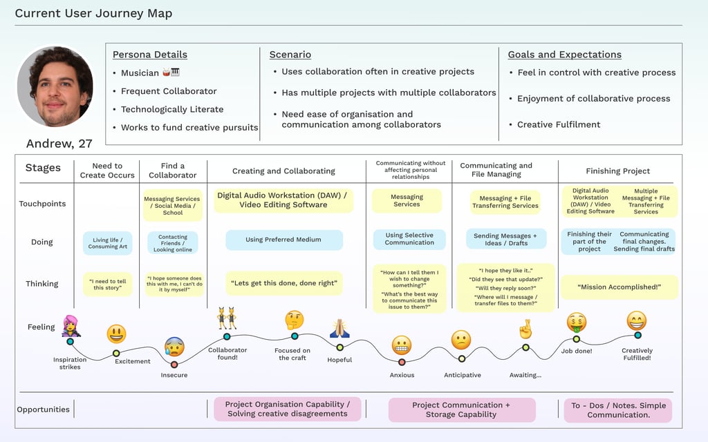
User Journey Map
I mapped out the users’ steps to see how I could simplify their journey to help them reach their most important goals with the service.
Thanks to the user journey map these states are now apparent and it's possible to prioritise the simplicity of the service to make it simple for people to contribute to the project.
#2 Project Communication -
Task Management -
Storage Capabilities -
Chat with collaborators and your group.
Comment on files and updates.
Storing files in your project and/or in folders
Task-box for managing progress
These are the pain points, along with the insights I obtained from my user research, that I will focus on for this solution I will be now begin designing...
Let’s goooooooooo!
Now, we design!
Starting with...
IDEATION
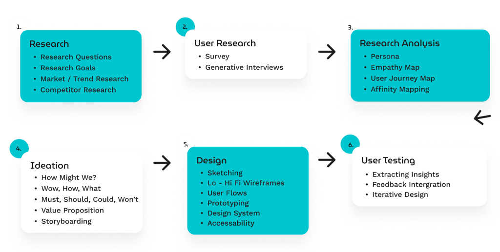
As part of the ideation process, we did a few exercises such as;
"How might we?",
"How, Now, Wow",
"Must, Should, Could, Won't",
"Why, How, What",
and wrote a "Value Proposition" to solidify the essential features and necessities of the project.


The Ideation sessions.. feat. My tutor, Margarita!


Uploads his own file
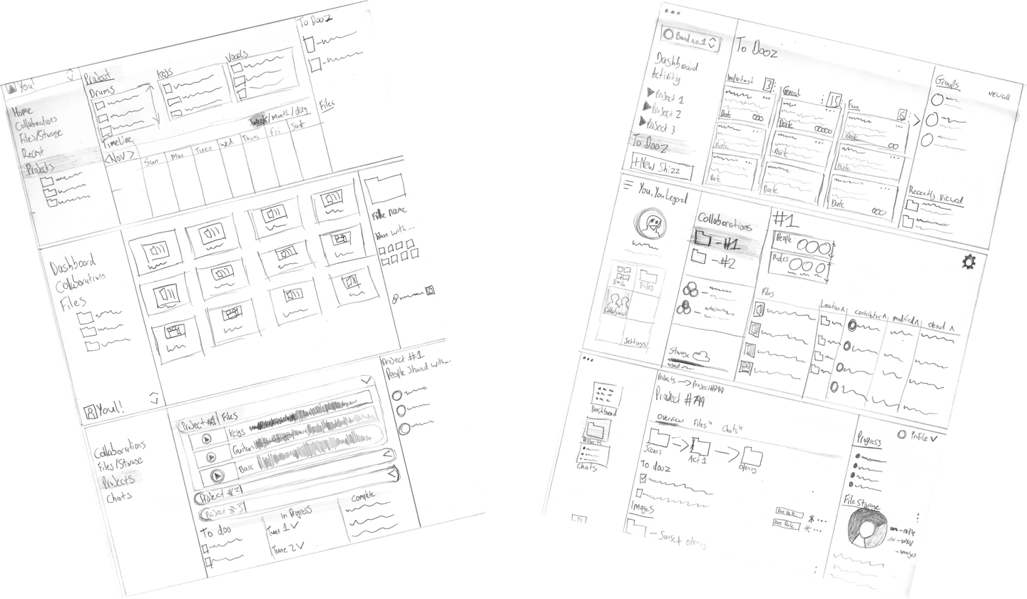
Sketches & Lofi Wireframes
In the beginning stages of sketching, I browsed the internet for inspiration and took note of some of the standards that come up for placement of features and the visual components.
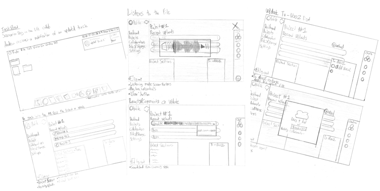
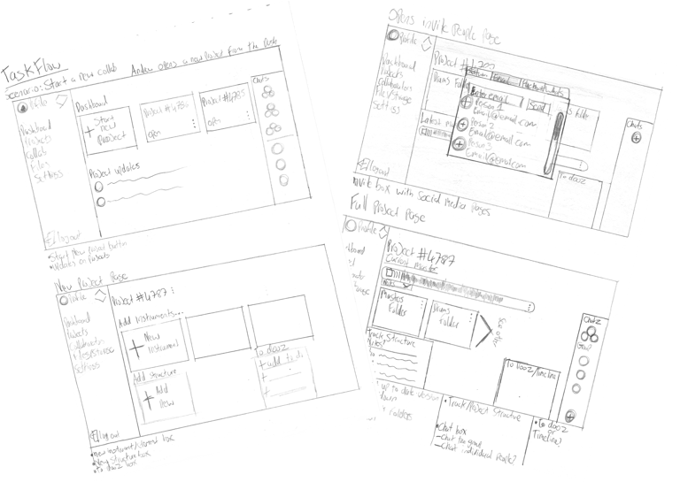
Taskflow #1:
Taskflow #2:
Day in the life of a collaboration
Starting a collaboration from scratch


User Flow #1
User Flow #2
Andrew opens the app and sees an update
He listens to the file
He comments on the file
Updates the tasks
Andrew opens a new project
He adds folders
He opens the invite window
Continues updating the project
Hi-Fidelity Wireframes

Here's what I Learned from this ideation stage
In the beginning stages of sketching, I browsed the internet for inspiration and took note of some of the standards that come up for placement of features and the visual components.
Wireframes, I will admit was where I struggled, as I wanted this to be a simple service it was a matter of production by reduction. I needed to familiarise myself with the standards of what I was seeing from my looking up of inspiration.
Don't bore us, get to the chorus!
THE SOLUTION!
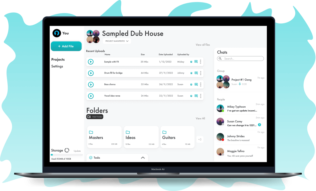

draftwerk
A desktop app that combines the logistics online artistic collaboration such as file transferring, messaging capabilities and project management
If you're interested in seeing the full project take a look here!
Style Selection
The style and branding colour selection came seeing what fitted the feel and intention of use of the service, decided to go with the turquoise green after reading about it’s symbolism with creativity, zest and new life, definitely a good representative colour.
Style guide
Fonts
Colours
Icons
Buttons
Logo


USER TESTING
Testing Goals
In doing the usability tests, the goals were to...
Validate the features of the designs, both conventional and specific to draftwerk, ie Project Manifesto, and see if they would benefit the artists current process of creating and collaborating.
See if there was anything missing from the standards expected in a collaborative management software like draftwerk.
The testers were compiled through various facebook groups for independent musicians. The group was mostly male, in the future I would prioritise more diversity.
All the tests were done via a google meet chat with the prototype in Figma presentation view being sent to them and we discussing the software through screen sharing.

Fix #1 - Preview Page
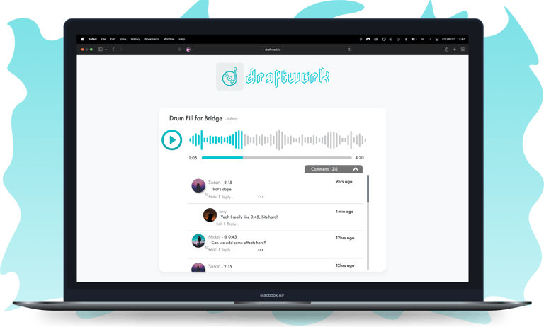
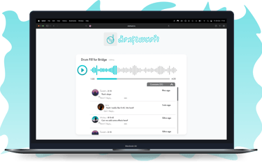
One user commented a the need for a preview page for those who have not yet joined the service.
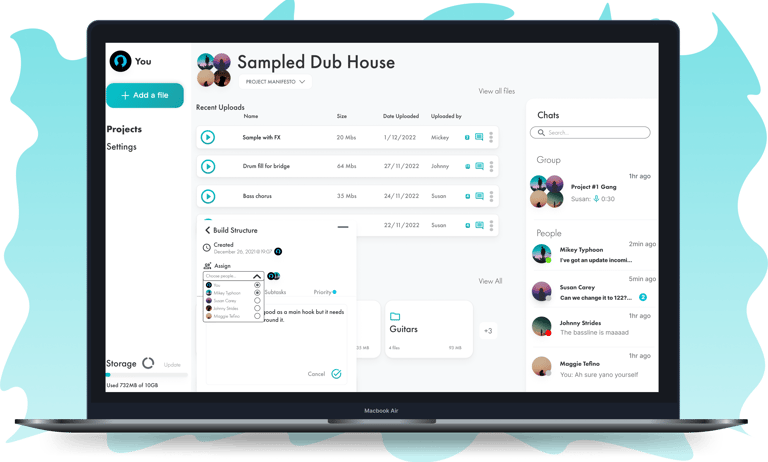
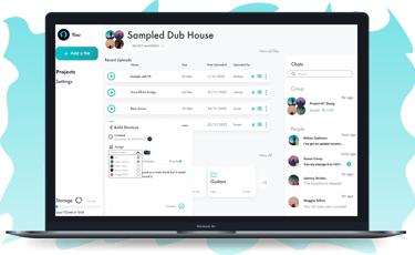
Fix #2 - Assigning Tasks
As they relied on this with other services to send collaborators files regardless if the collaborator had a profile or not.
This could also entice potential users to join having seen the aesthetic of the service.
Another user stressed the importance of assigning certain users to tasks.
In giving them a role, it democratises the projects and clearly distributes the workload.
CONCLUSIONS
After completing this project, I reflected on it to see the points which I found an aptitude in but more importantly to reflect on the areas I struggled and had to bare the climb of the learning curve, but it’s all part of the process
I found the interviewing stage very enjoyable, mostly in learning how to craft the correct questions to ask at the right time to generate as many insights as possible.
The areas which I found challenging were the wire framing and initially building of the UI stages. I would need to develop my eye for detail. As improvements took some time, patience, trial and error, and a lot of help from my wonderful tutor. (thanks Margarita!)
